From Storyboard to Screen Part 2
Today I have a couple more images coming your way from Storyboard to Screen on my recent experimental, short film ‘Smile: It’s Only the End of the World’.
One of the most important aspects of the film was creating a dystopian version of Edmonton that not only imagined the city somewhere in the near future, but also had the badlands in the outskirts of it. If anyone knows Edmonton, Alberta the closest Badlands are about 3 hours south in a place called Drumheller. Naturally, that’s where we filmed all the badlands scenes. But the challenge came when we had to combine the two plates and keep the elements of the city consistent throughout.
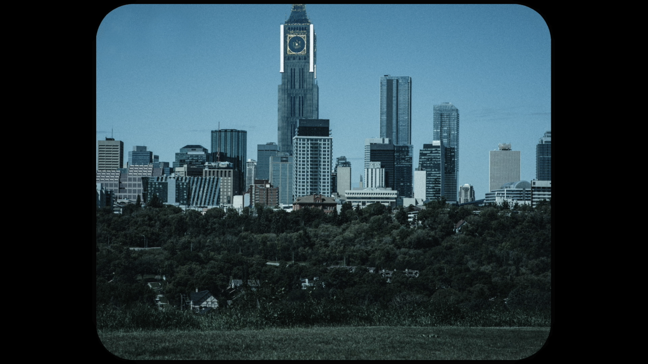
This was my initial storyboard. The elements I needed consistent were: The smokestacks, the black sky, the towers, and most importantly, The Clocktower. Thematically the clock tower is the single most important design piece in the entire film.
On the literal side of things, it’s the centrepiece and the tallest building in the city. It’s the main image that represents this oppressive, dystopian world. Metaphorically, the clock represents: capitalism, the constant movement of goods and services, the 9-5 work-shift - essentially a society built around a clock. If the clock (time) stops or is reset, what happens to society? That’s the question the film is asking right from the beginning.
As far as the other elements involved they represent overpopulation, pollution and obviously the black smoke is just a product of all of that. The black smoke is also a major piece to the design of the world because it surrounds the city; the rules of the city all revolve around the black smoke. And, the black smoke actually enters our main character’s (Zara played by Kaeley Jade) body (as you can see on my last BLOG POST) - although that’s when we can start looking at the film metaphorically through Zara’s journey. But I won’t go there, you can draw your own interpretation on that front.
This was the plate that we shot at Horseshoe Canyon in Drumheller, Alberta. We lucked out because it was a cloudy day to begin with. I feel like if it was a sunny day things would have been overexposed and it would have made things extremely difficult for our VFX Team at Alpacalypse Productions to match since the world is extremely dreary and dark.
This is the final product. As you can see we have the clocktower in the distance. Badlands in the foreground. Towers, smokestacks and that thick black smoke looming in the air. As you can see, the final version of the film was 4:3 to help create that boxed in feeling like a photograph or a memory.
Next we will look at what Dystopian Edmonton looks like from within the city…
We get to see the city at two different times. Present Day which is the Dystopian version of Edmonton we have seen before. And then we see it through a flashback and it appears much like it does today in 2022 which looks like this (minus the Clocktower):
Circles are the one shape that appear quite a bit throughout. This is completely by design. The reasoning behind this is that time is circular - there is no beginning and no end. Since that is so important thematically, I wanted to have circles everywhere in the imagery. One of the most important set pieces is the bike and the bike wheel shot below that appears twice.
The first time, it is from the perspective of a girl riding a bike who is watching Young Zara get taken away through child services. The next is from Zara’s own bike later in her life. Without going too much into it, it represents a passage of time and change. And specifically, in this instance, it’s the painful childhood memory that has stuck with Zara throughout all these years and shaped who she is as a young adult.
This poorly sketched drawing is pretty self explanatory. Let’s take a look at the Flashback image:
This look is different than any of the other images in the movie. This is because we shot it on my iPhone to give it a different feel and different look. Zara is speaking about social media and how it relates to her own life through memories, so I thought hey might as well go full with it and shoot it on an iPhone too. Next is the second time this shot appears. This time through Zara’s bike. This is the original plate:
Again, we lucked out with the gloomy Edmonton day. It was raining for the majority of it when we were shooting interiors. Thankfully it stopped for the couple hour window we had for shooting exteriors. Next is the final version that you would have seen in the film:
Look at that beauty! I love this shot so much it hurts. The drones, the towers, the smokestacks it’s pure, dystopian bliss! You’ll notice the bike wheel is also facing a different direction. This is also by design. It’s to show a change in character through screen direction. In the first image, Young Zara is getting pulled towards the city (from left to right). She soon becomes engulfed by it and this leads to her mental health disorders down the line. In the second image she is going the opposite way and leaving the city (right to left). She’s finally escaping everything that has been oppressive to her throughout her entire life. It may seem like a small detail but I find things like this often go overlooked even though they play such an important role in telling the visual story.
I hope this blog post was informative and gave you a little more insight to the film, the creative process and how we managed to turn Edmonton into a dystopian, Orwellian nightmare. Stay tuned for more posts to come!


